Behind the Design: Branding of TEDxUbud 2017
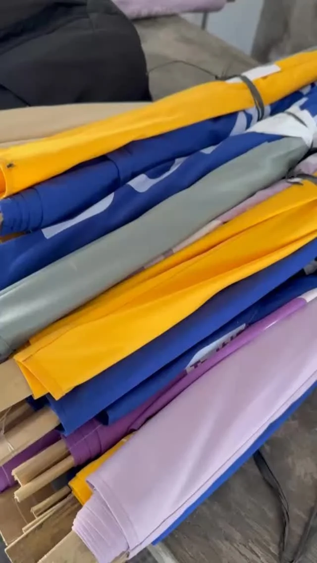
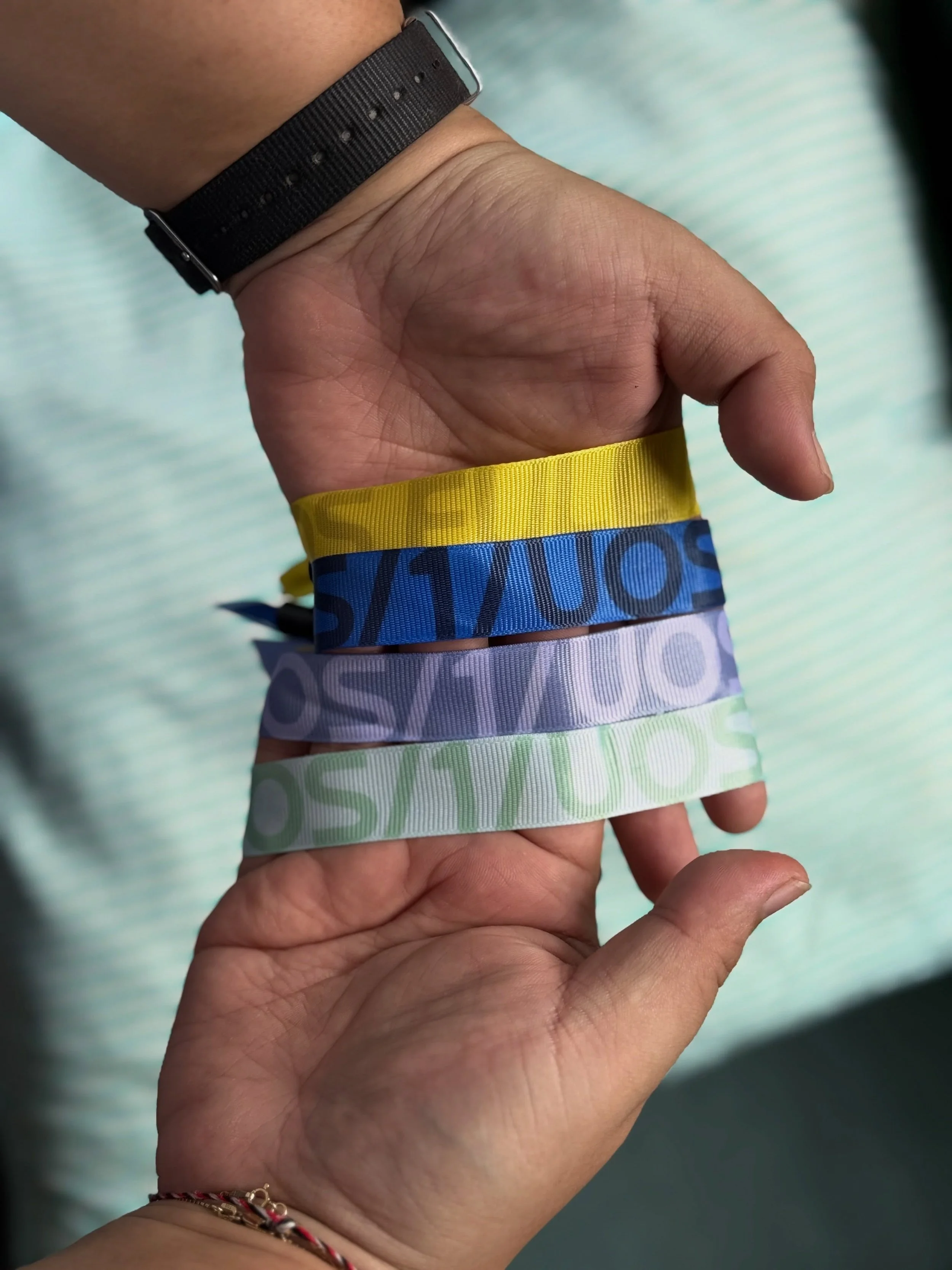
/This year we really wanted to design the event materials with bright colors for TEDxUbud. Focusing on the event theme of 'Make the light' and exploring the play of light as night falls, we created these three color gradients for the TEDxUbud 2017 branding. Blue for the last light before night falls, purples for sunset and dusk, and green for the elusive aurora lights.
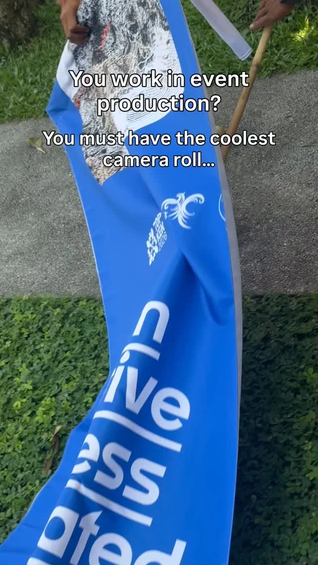
The experience banners were printed to hang from trees throughout the event venue—to help attendees navigate the area and let them know about all the cool things that were happening off the stage.

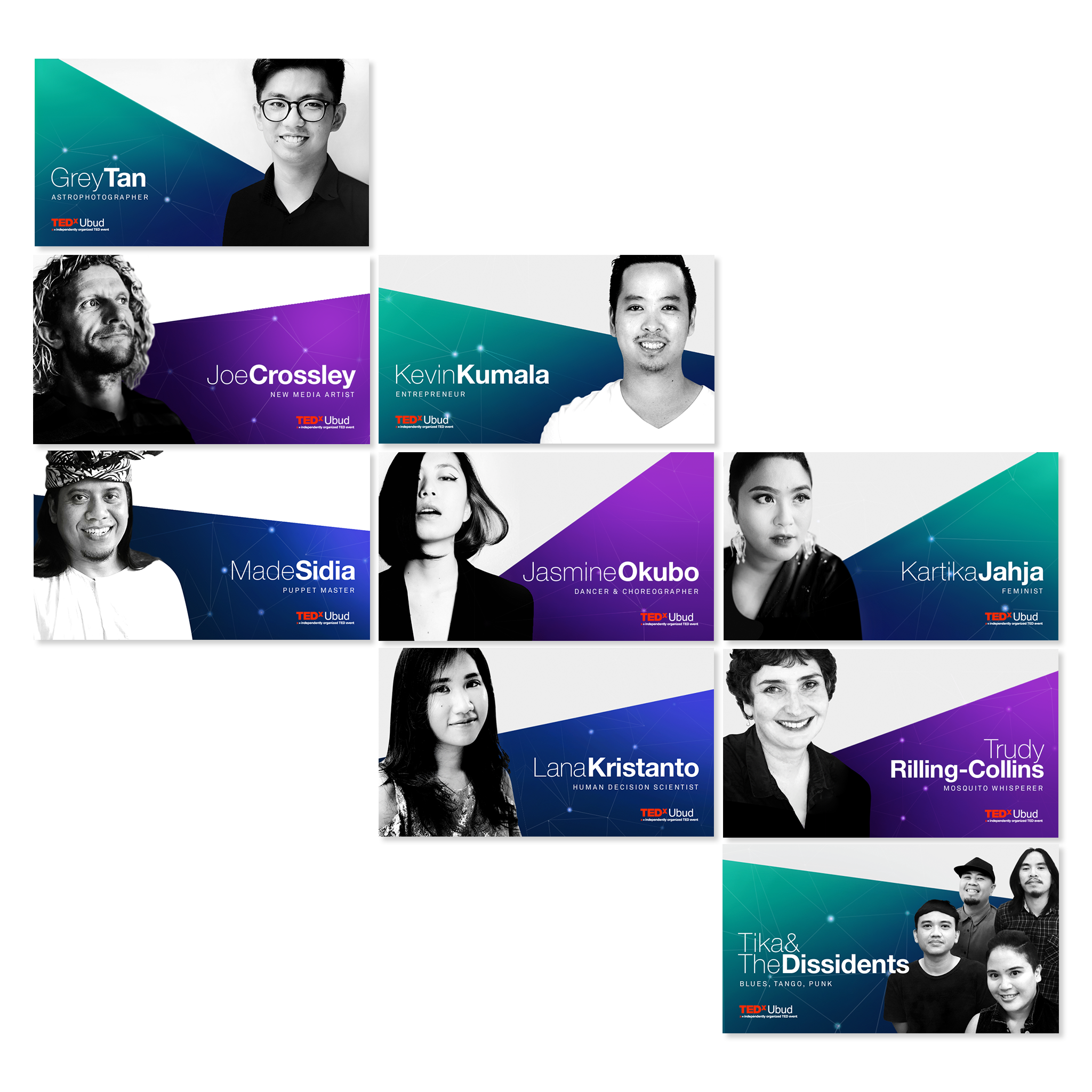
With our speaker flyers we wanted to include white space to give the layout balance and chance for the eye to rest. We wanted the attention to be on the speakers themselves—the 'spotlight' of the design. The inclusion of a subtle unique constellation was a nod to the event being held under the open sky at night. Many of the traditional TEDx design elements were incorporated, including use of Helvetica and the red/black/white colors for the logo.
Finally, our quote postcards. A fun way to surprise attendees—we leave them hidden around the venue on the day for attendees to find and take home.