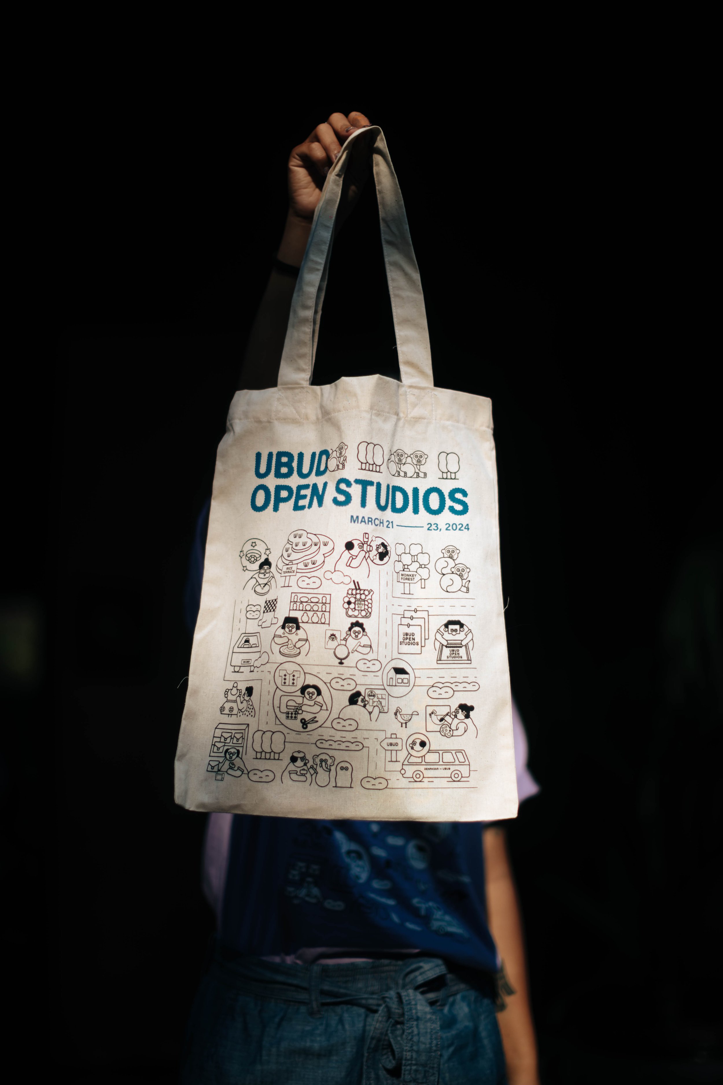
Behind the design: A Royal Dinner at Ibah
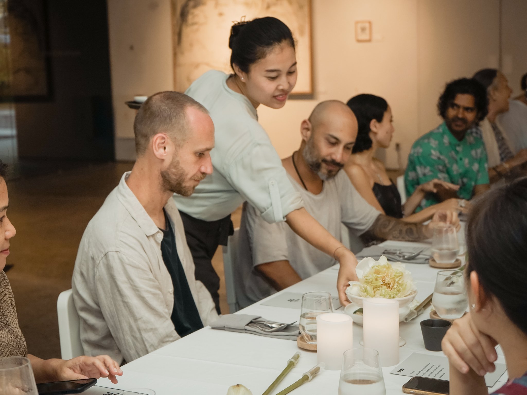
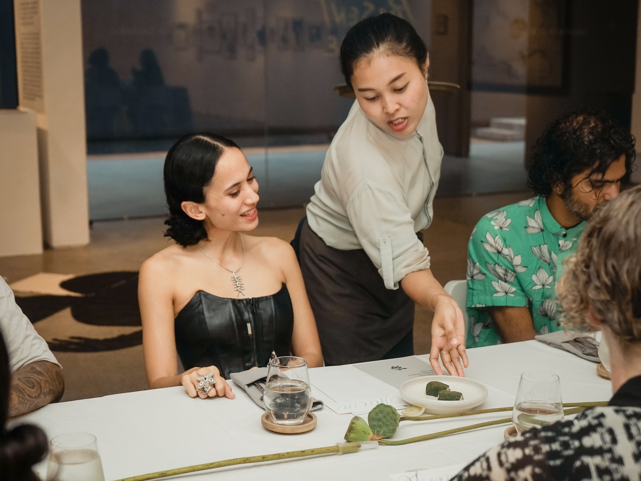
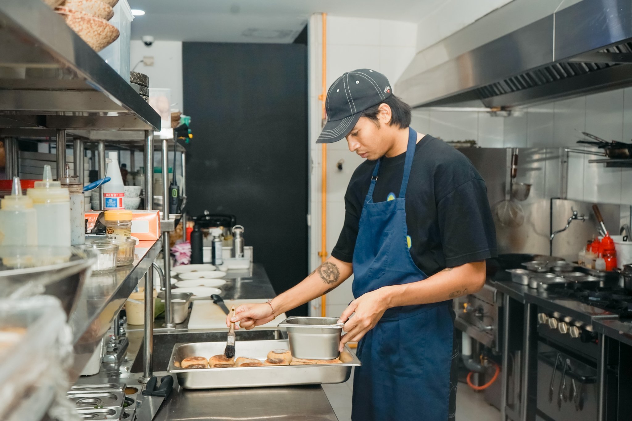
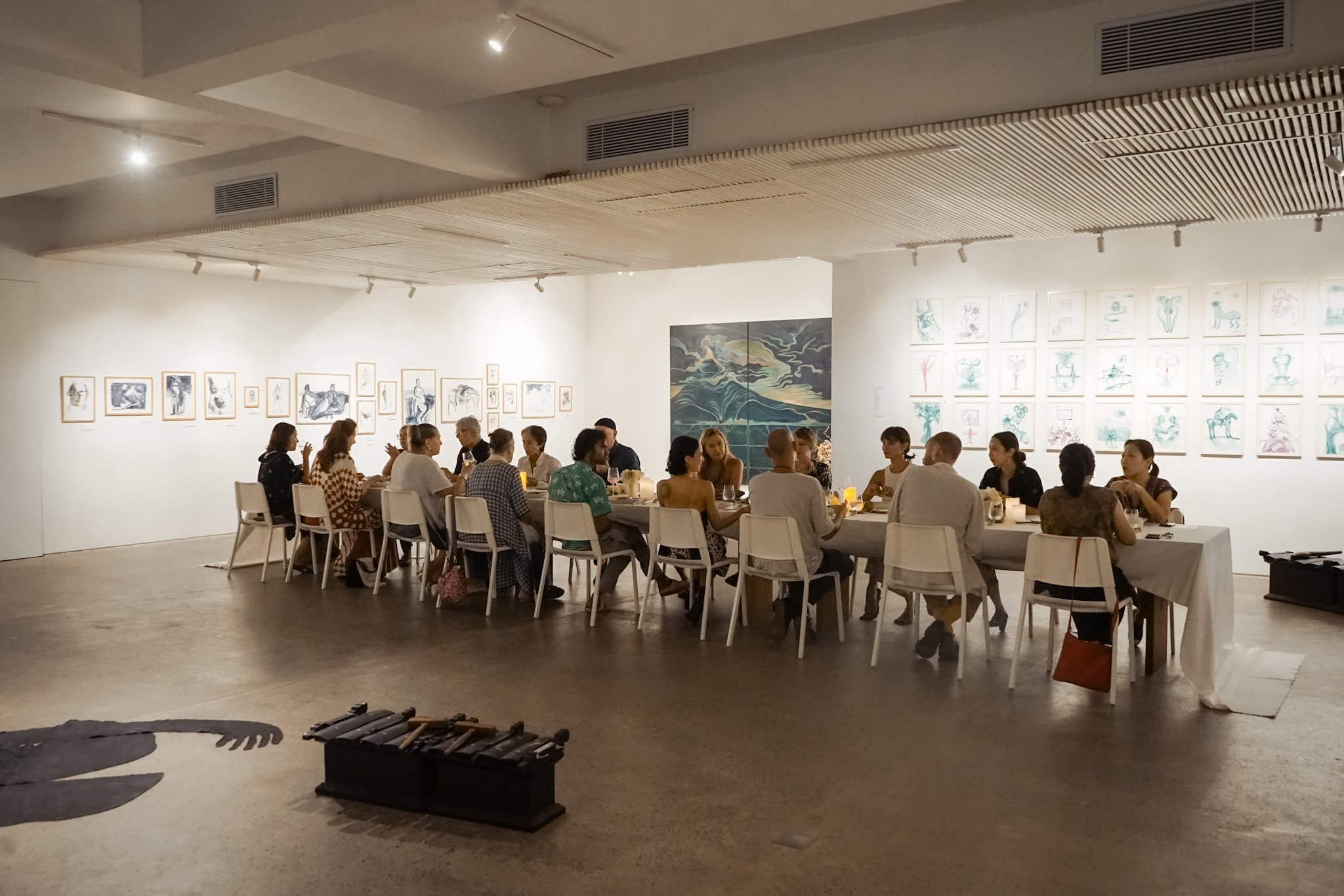
/We were honored to helm the design and production of a private dinner for 50 people at the Ibah property hosted by the Kerthyasa family. The dinner was created for guests to meet members of Ubud’s royal family and to learn about Ubud’s history and heritage, while experiencing it surrounded by the stunning architecture and landscape of the property.
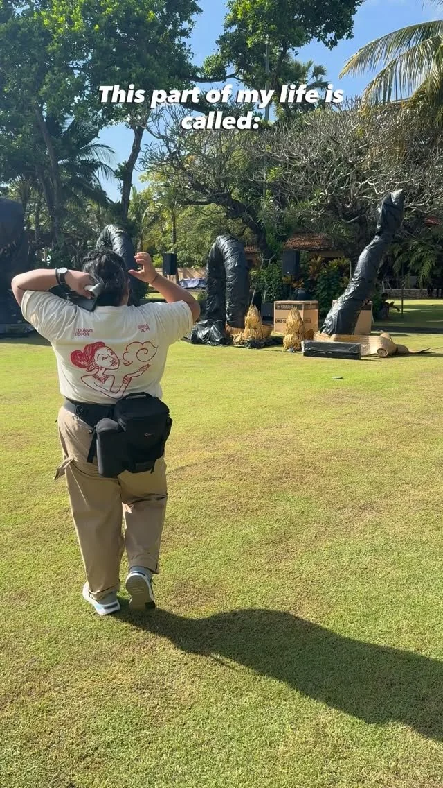
Facing the threat of rain in a very unusual August climate, we pivoted in the last 48 hours to redesign the event spaces and rethink the whole evening, a massive undertaking for the team and Ibah. We moved the dinner into the lobby area, kept the cocktail area in the main restaurant, and created a stage and seating for audience in the garden.
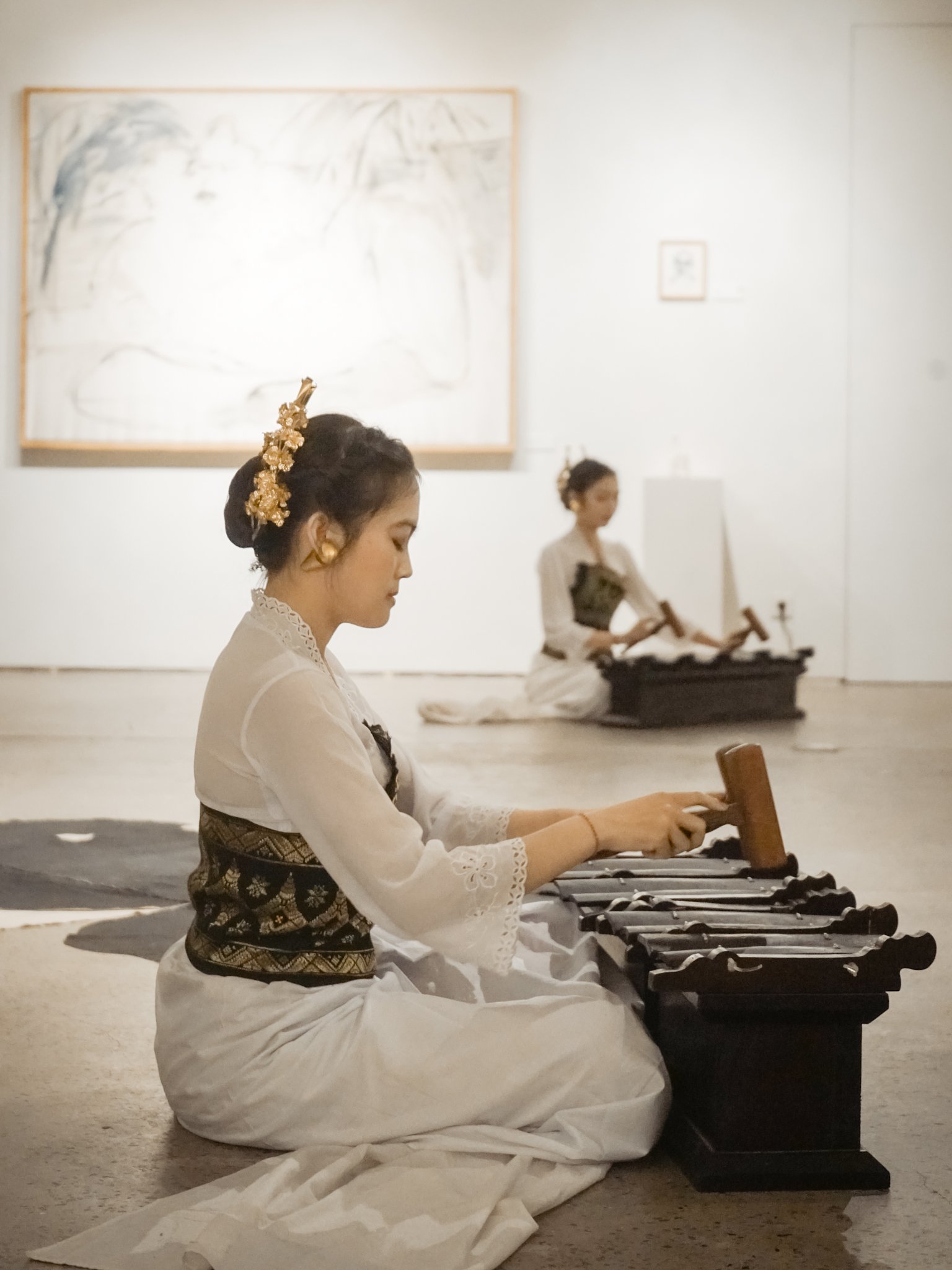
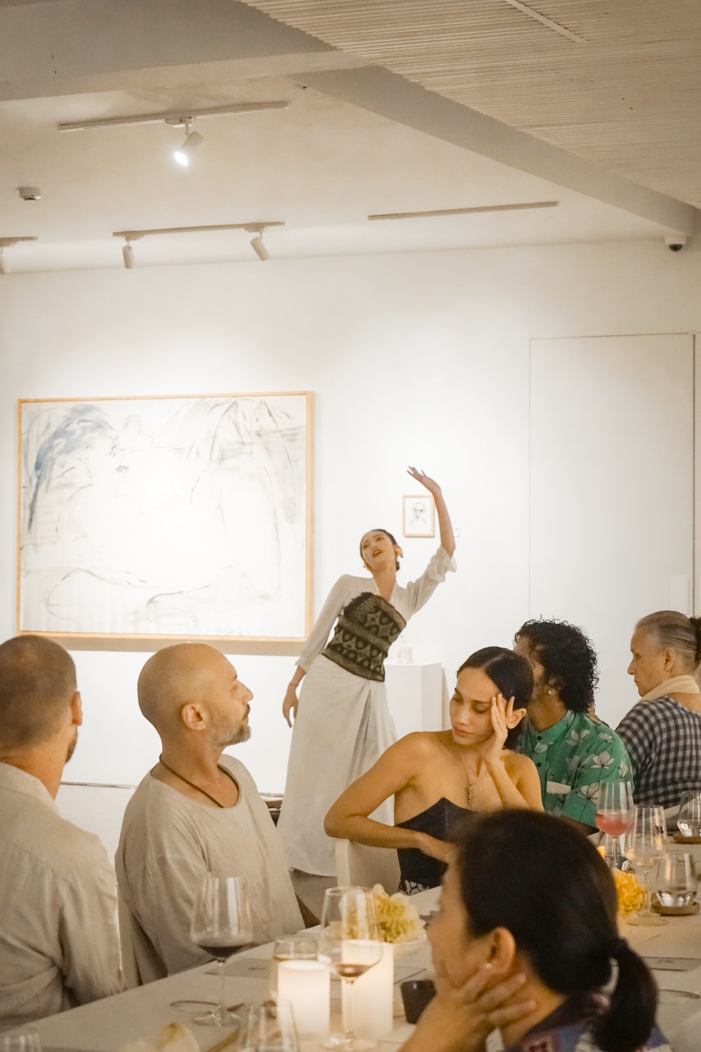
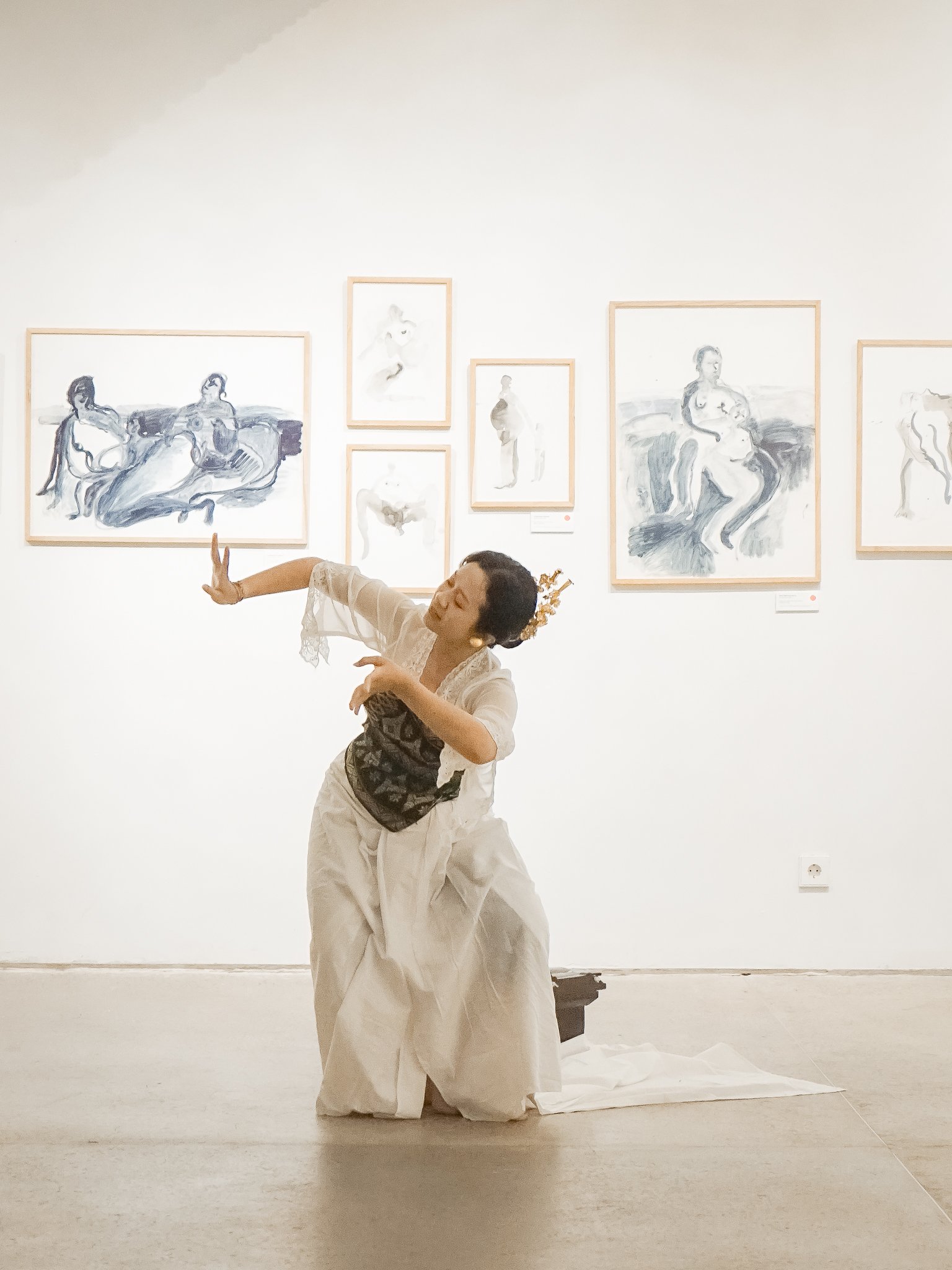
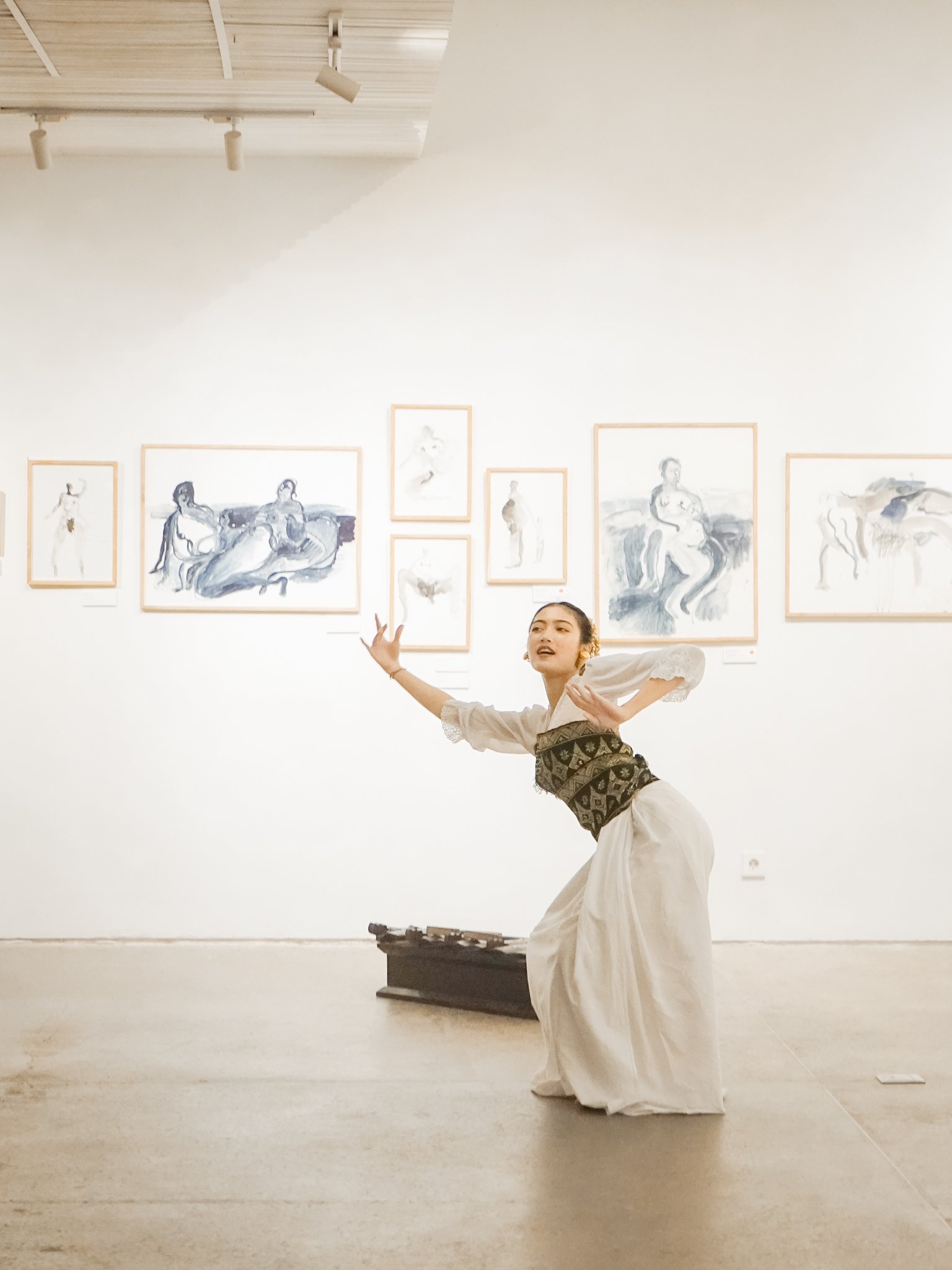
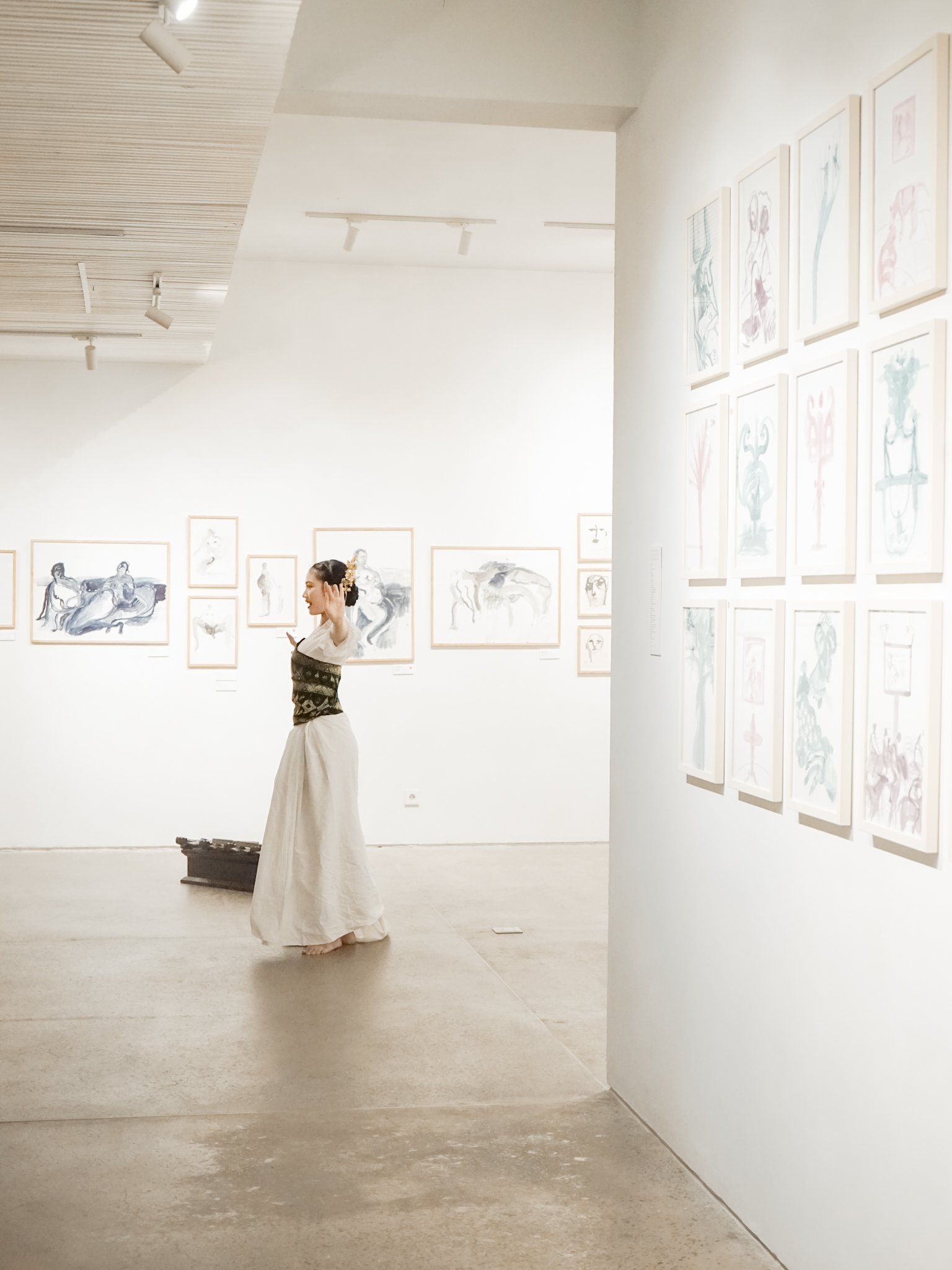
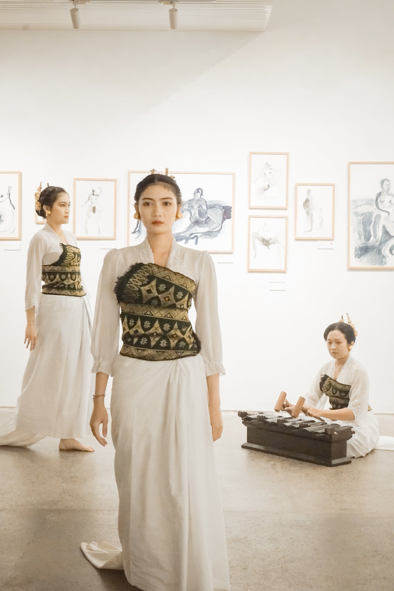
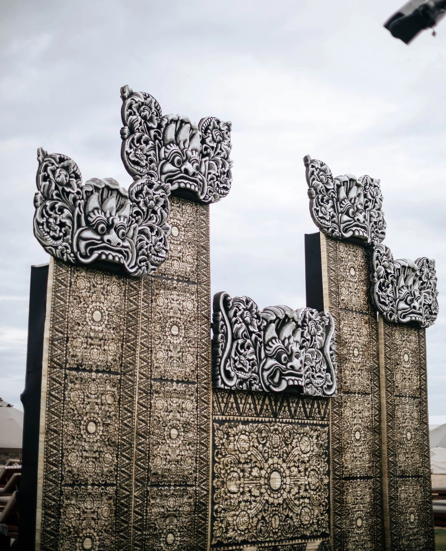
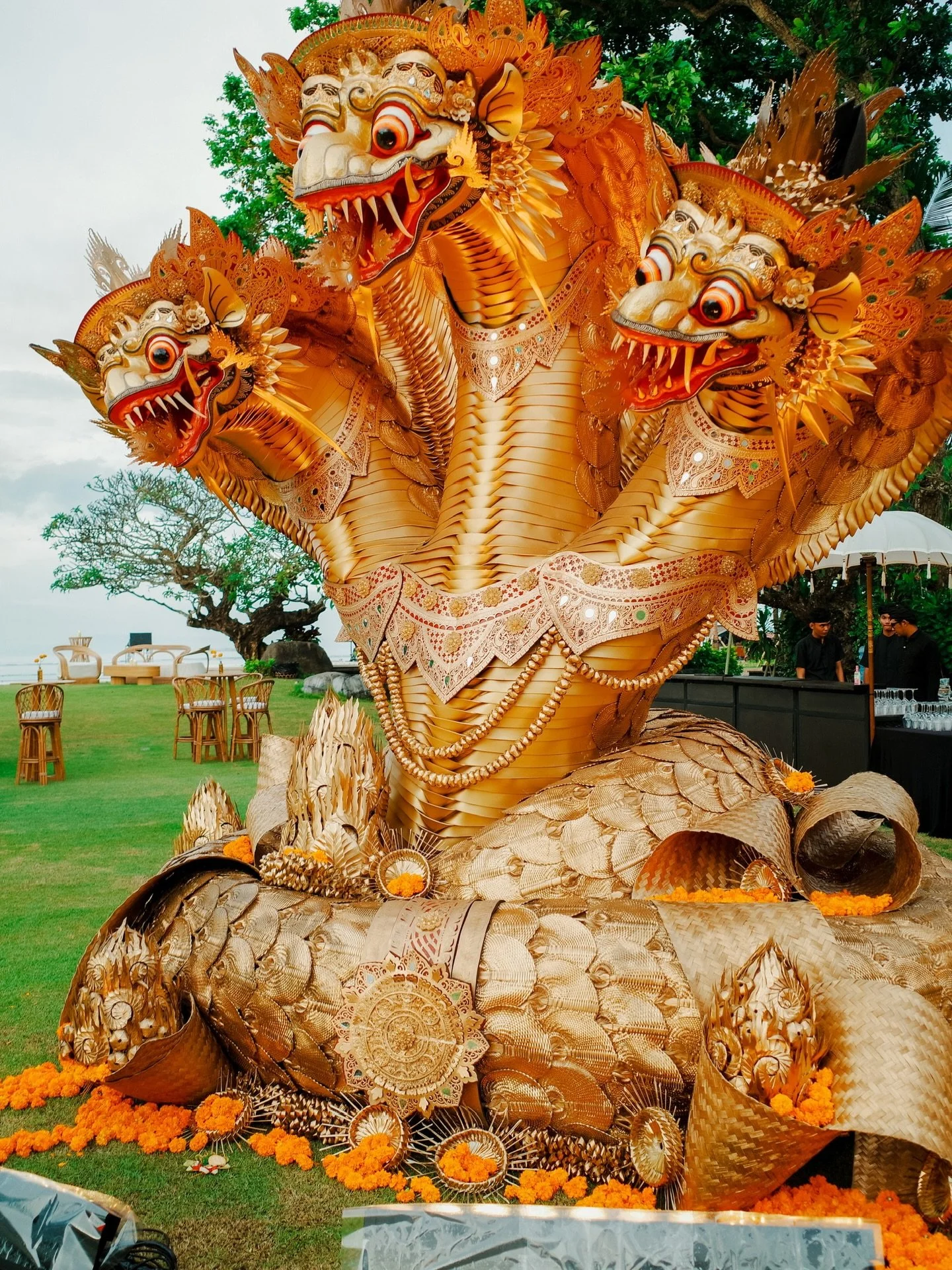
The guests entered through a traditional Balinese stone gate decorated with handwoven gold accent pieces, after being greeted by a friendly barong troupe. They then passed by the animals of Bali, wayang leather shadow puppet figures emerging from the garden beds as they walked towards a sole dancer positioned at the end of the walkway.


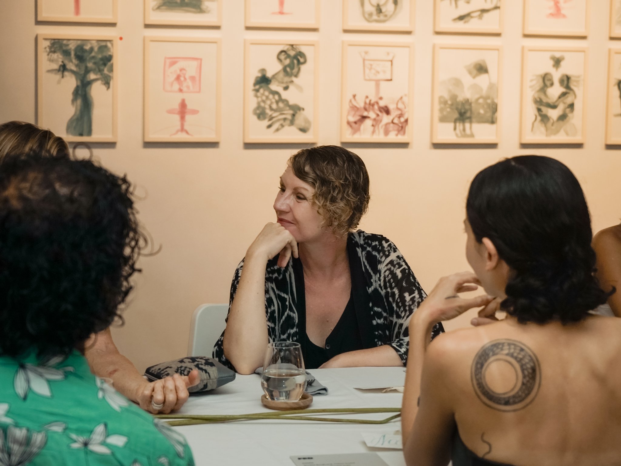
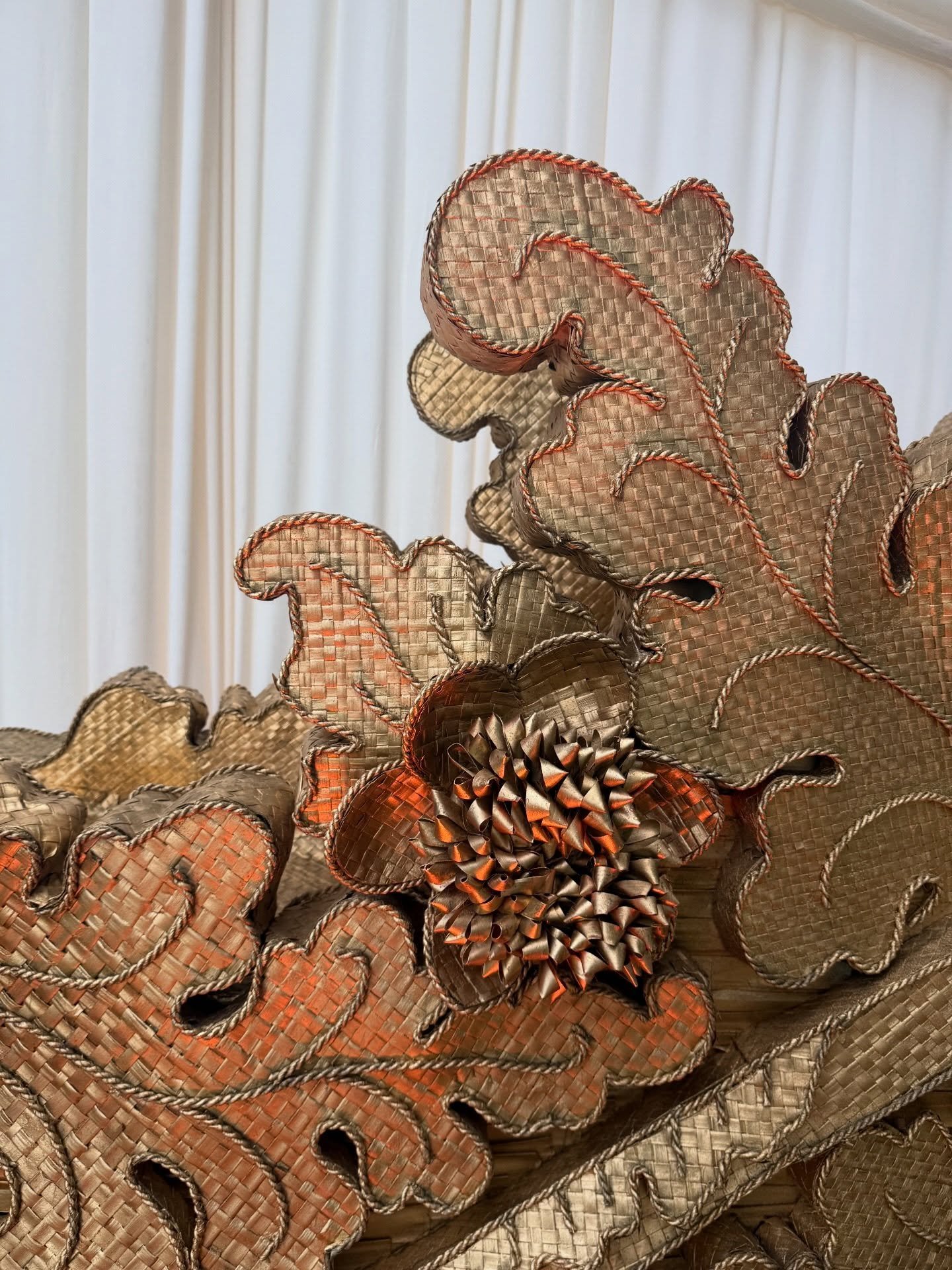
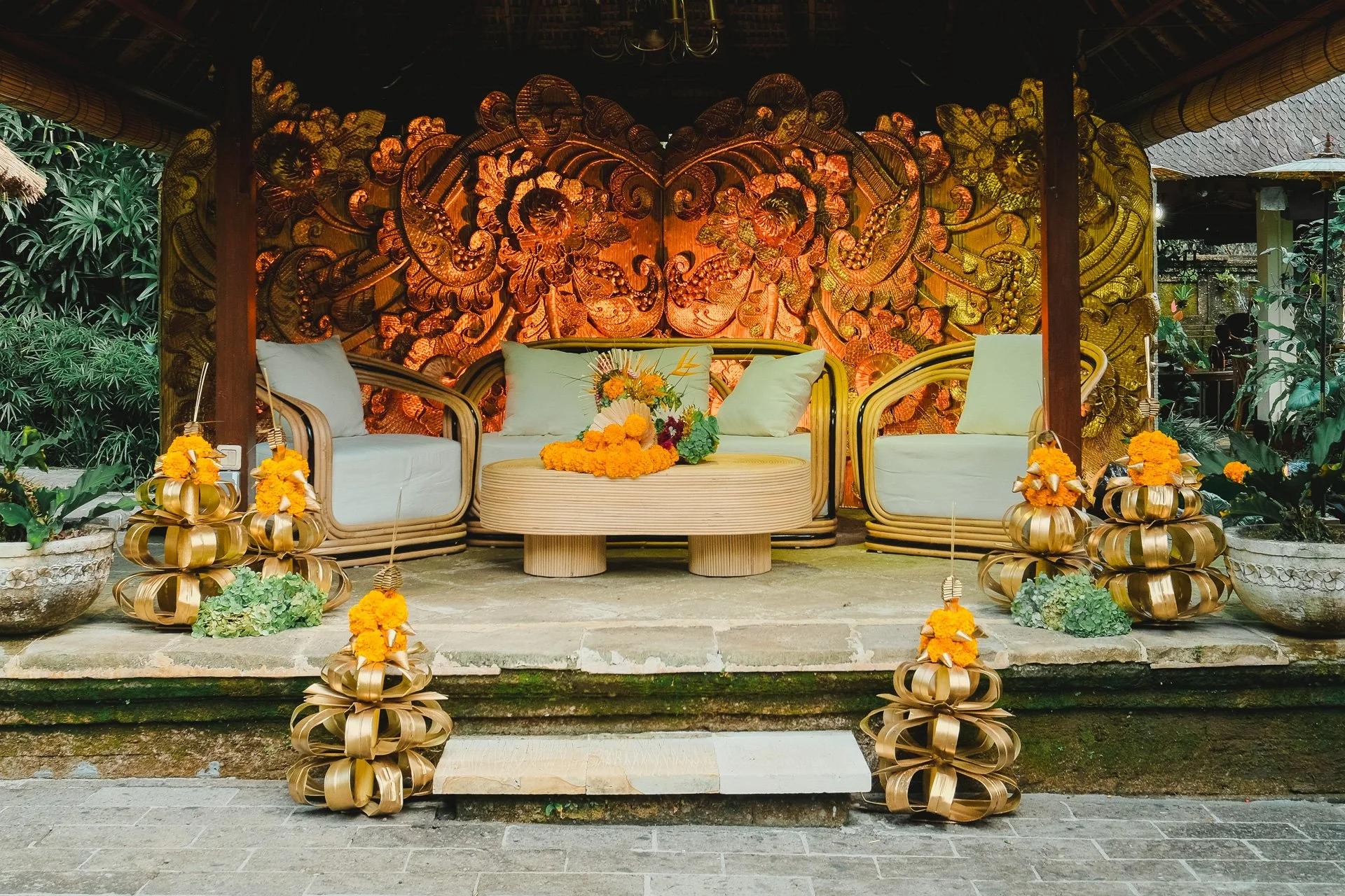
Some of the Kerthyasa family members gave a brief talk after cocktails were served under open skies to help guests gain a deeper understanding of Ubud. They presented against a beautiful hand-woven leaf backdrop featuring traditional Balinese floral motifs.
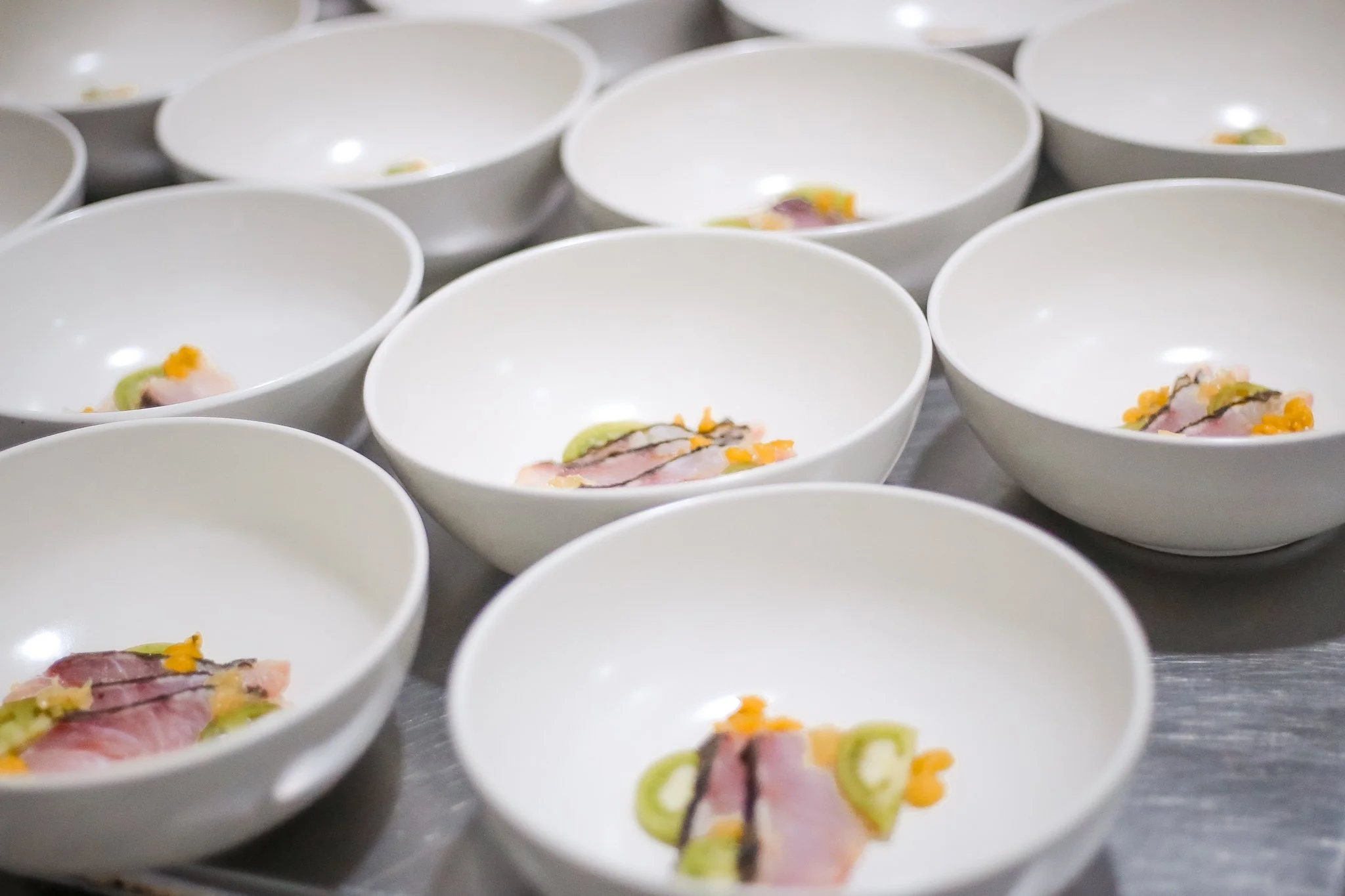
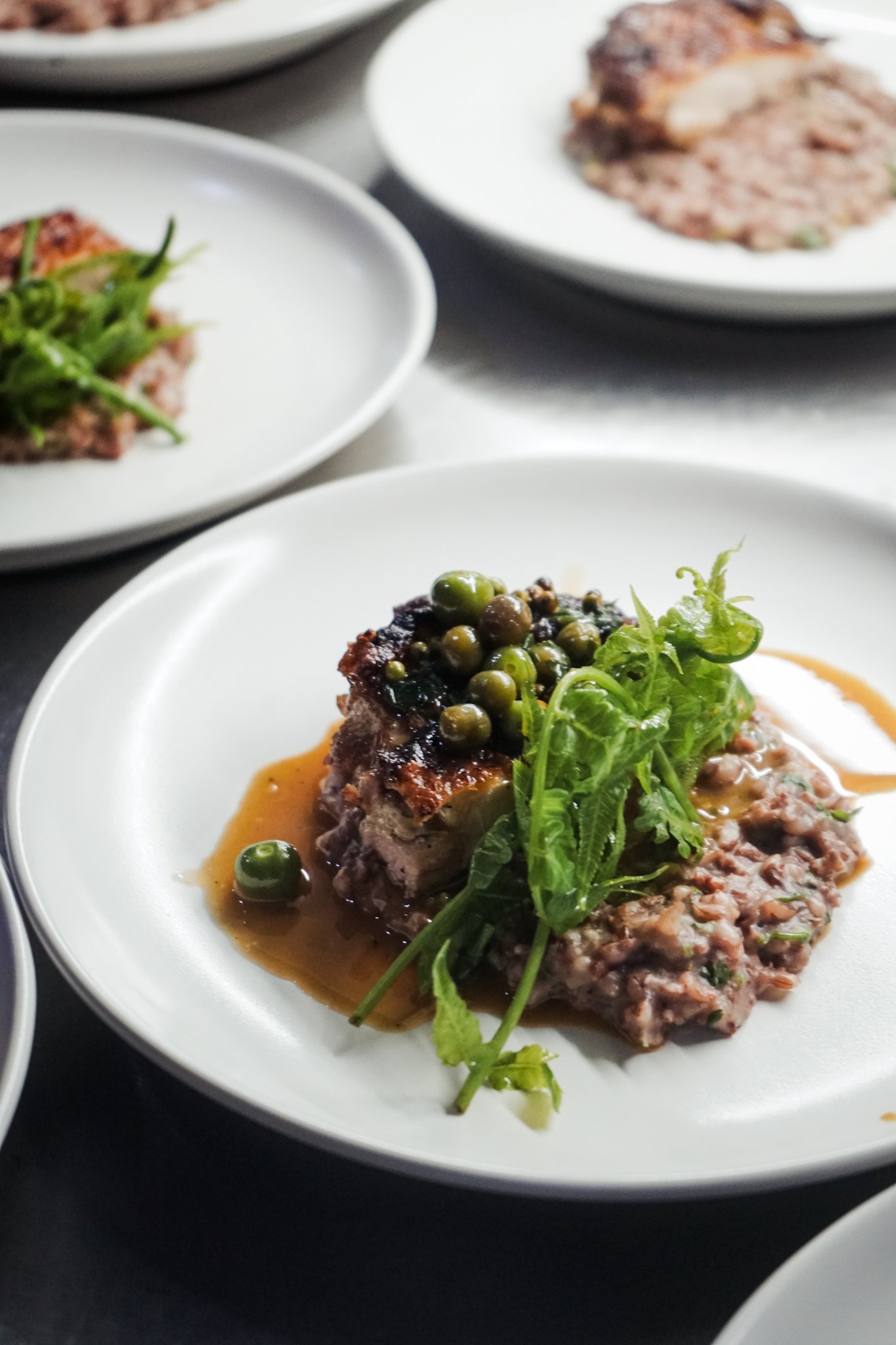
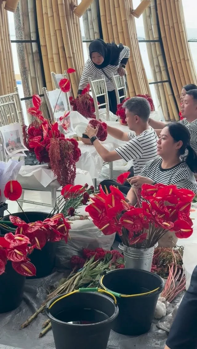
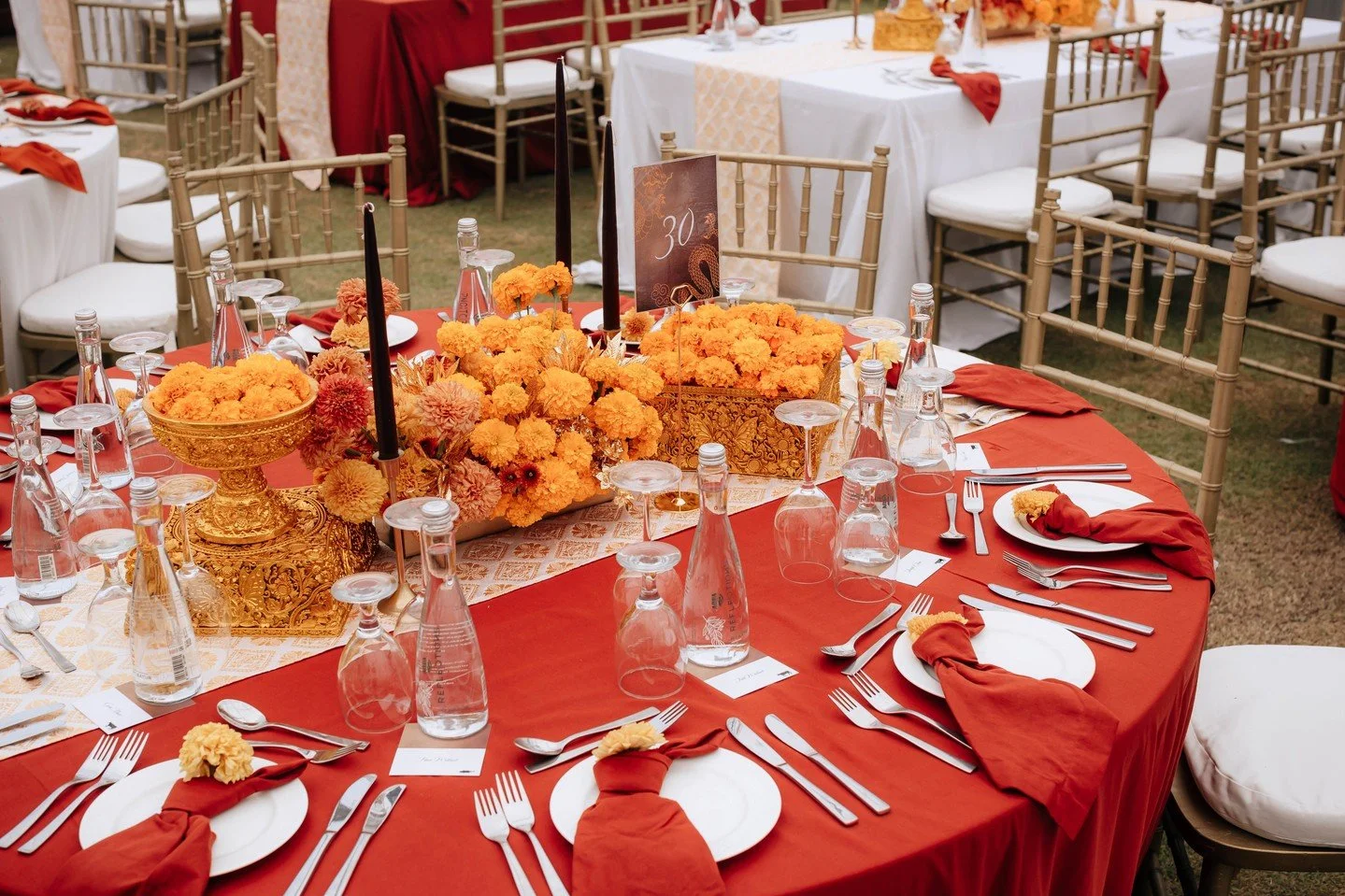
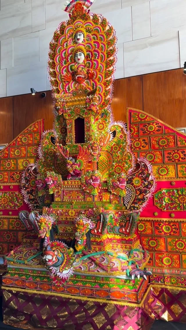
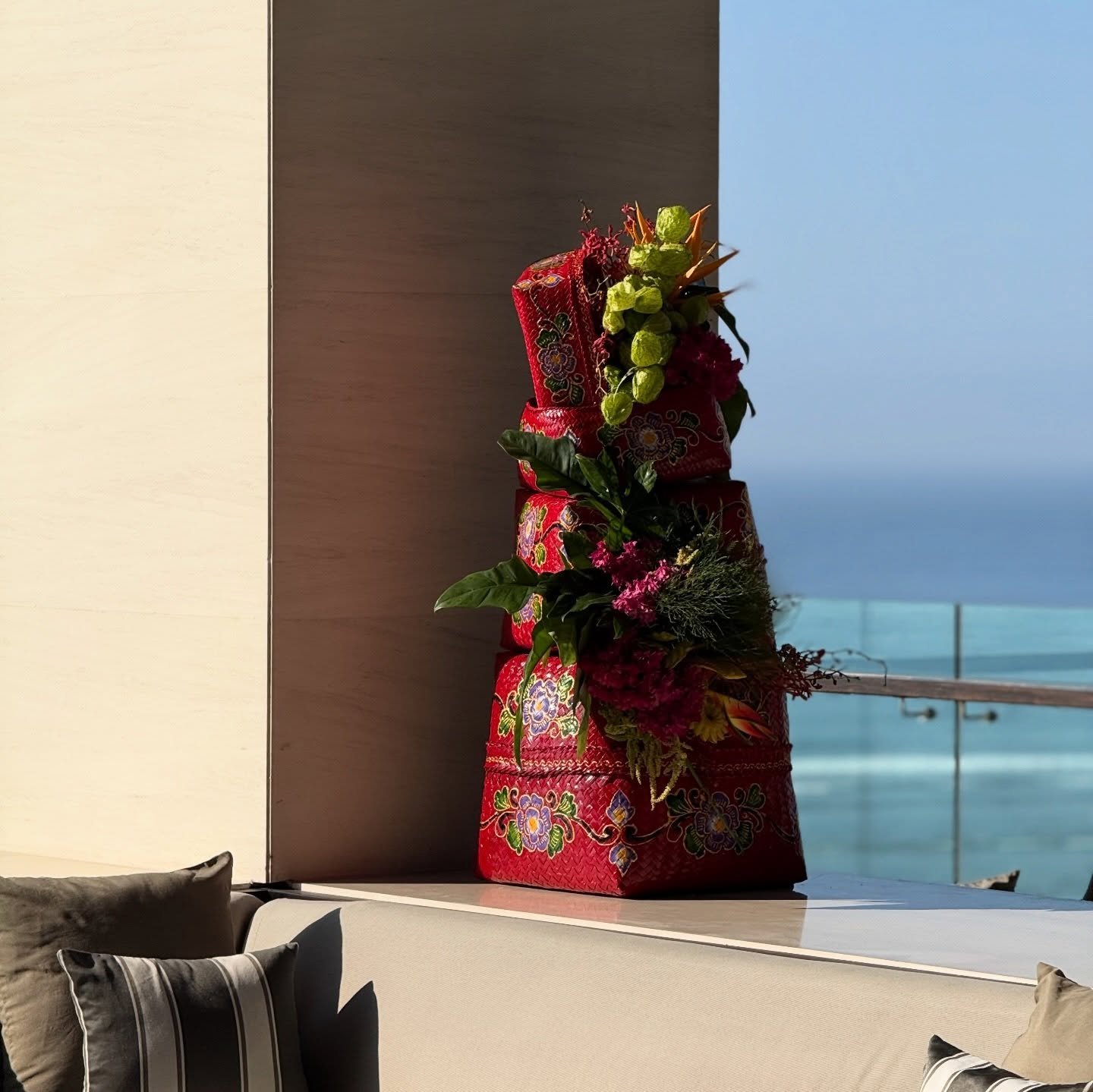
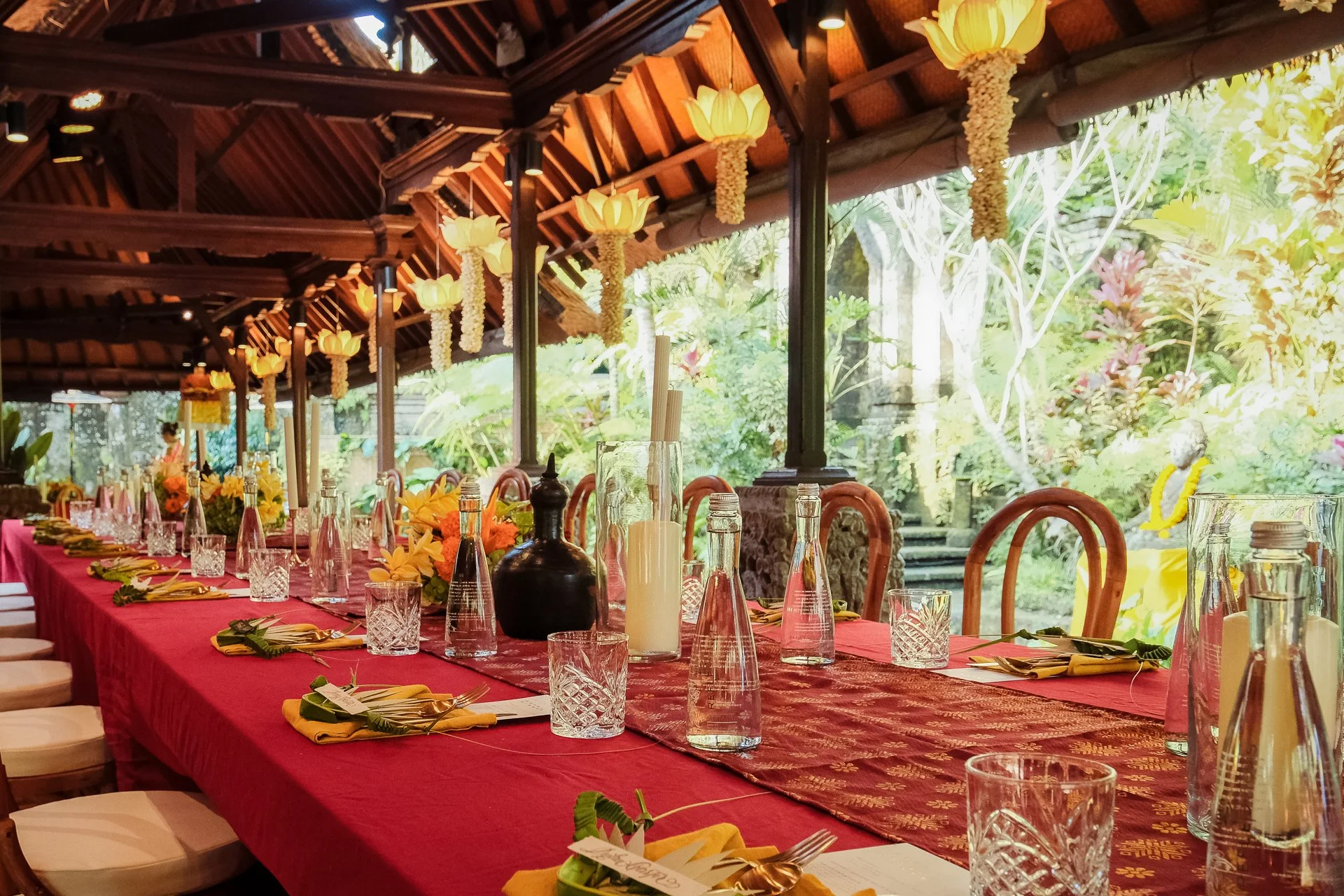
The tablescape featured local flowers like marigolds, hydrangeas, and strelitzia, interspersed with handwoven traditional Balinese offering components. Place names were held by intricately pieced together offering components representing the head of a dancer.
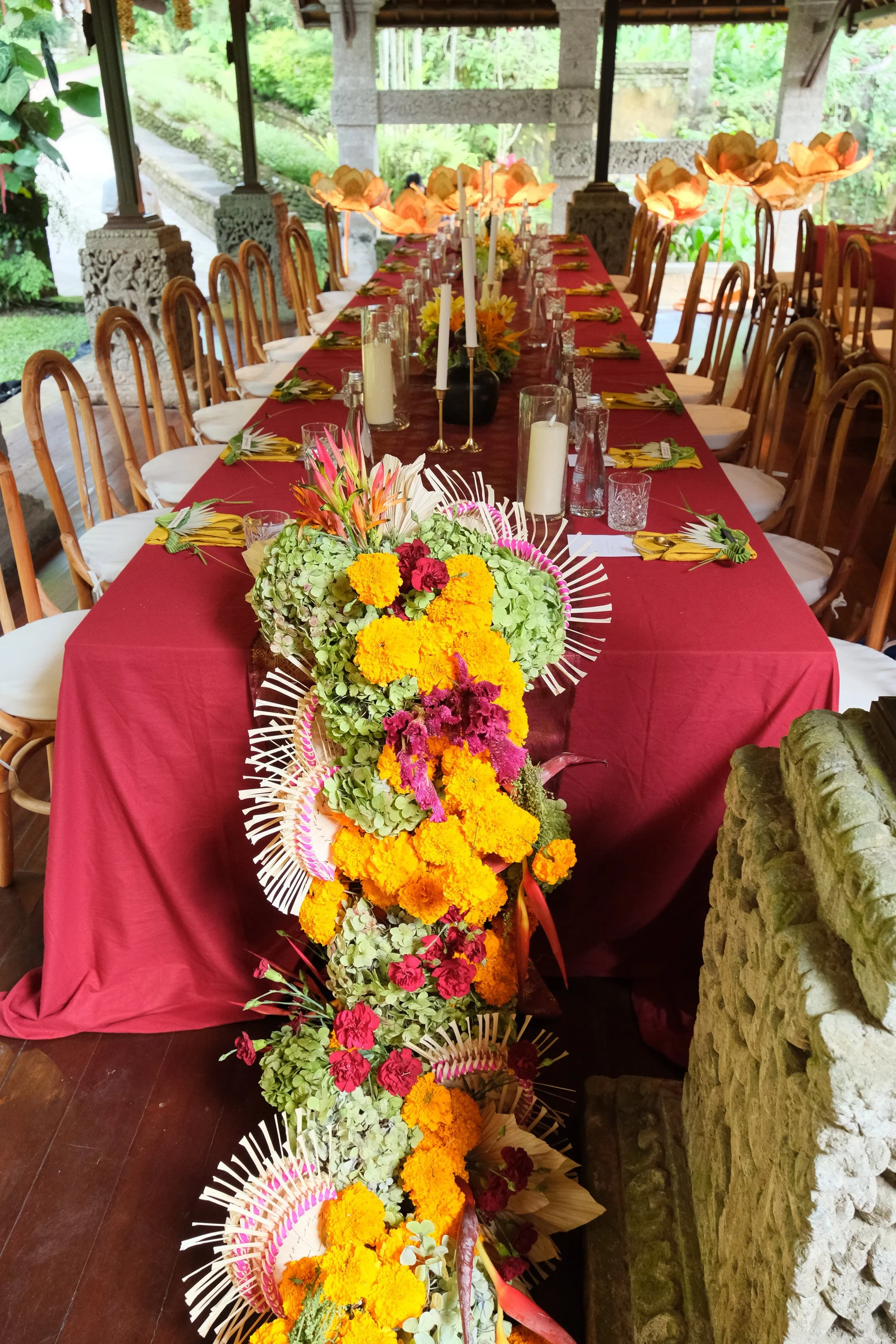
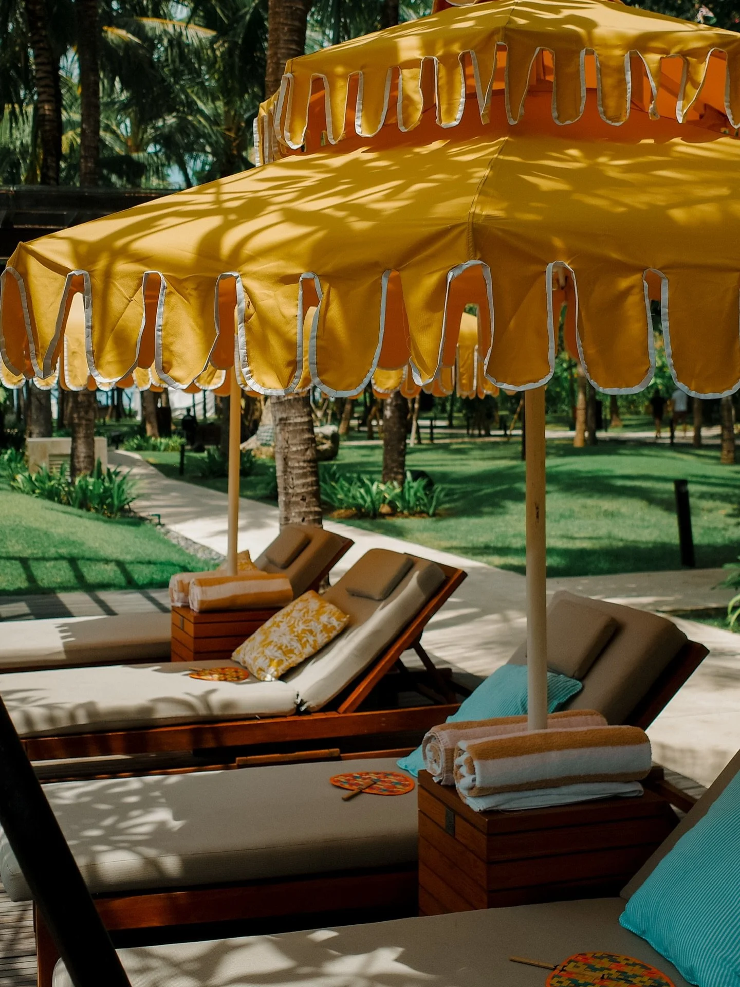
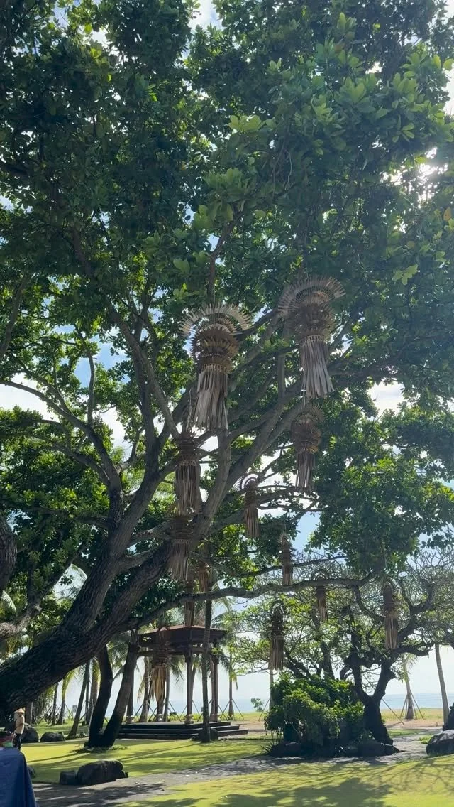
Lighting came from human-sized standing lotus lamps and hanging lotus blooms, all made from natural leaf materials, and candles wrapped in banana skin lining the footpaths.

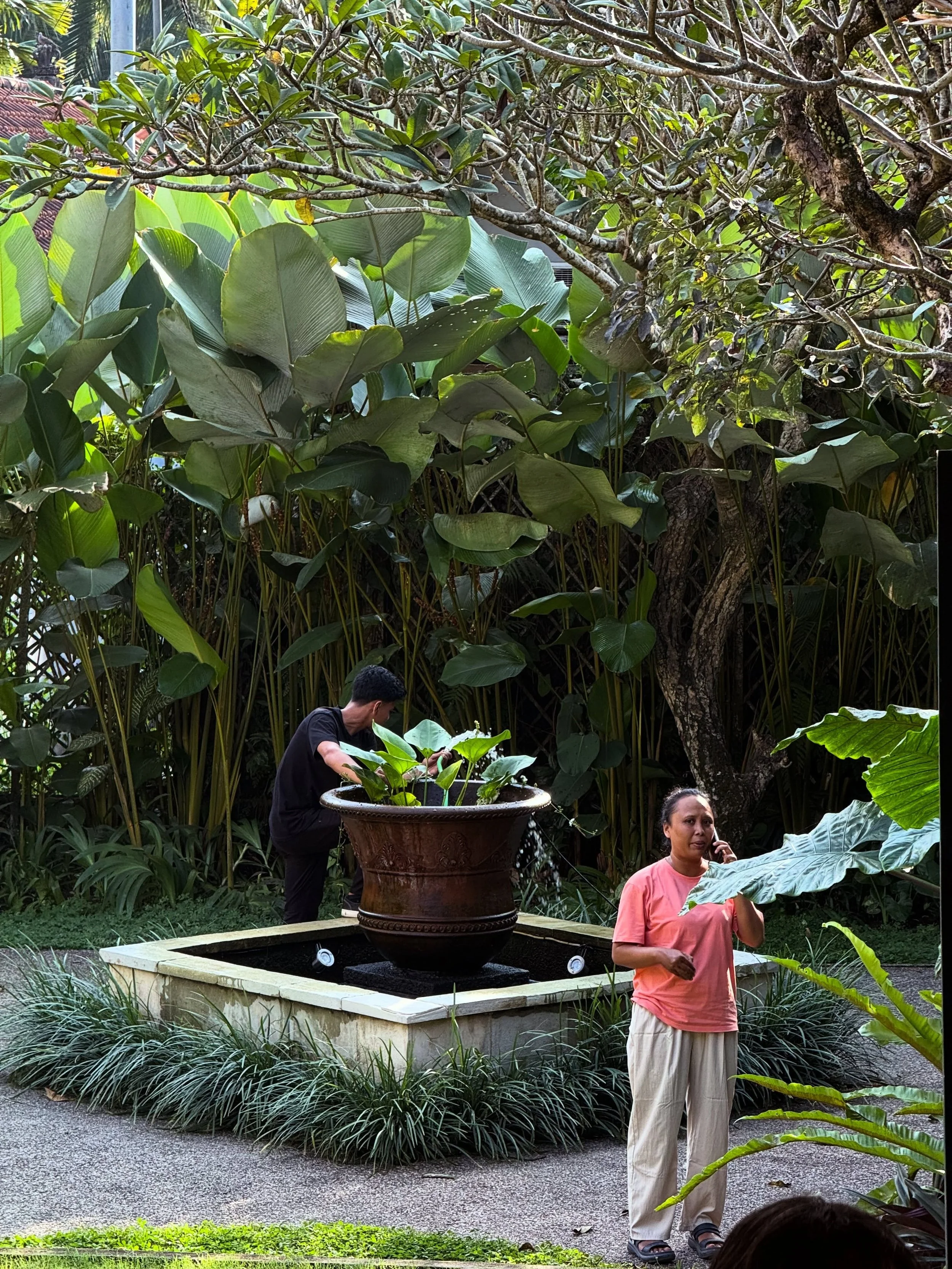
Ibah is located on the historical grounds of the Campuhan Valley by the Wos River in Ubud, built on ancestral lands that were gifted as a wedding present to the founding family.
The property serves as both a sanctuary for travelers seeking a ‘old Bali’ experience and a vibrant tribute to preserving classic Balinese culture. Tjokorda Raka Kerthyasa holds the position of Bendesa Adat of Ubud (Head of Customary Village Organization) since 2009 and is one of Bali's respected authorities on culture and local traditions.
The Ibah property represents a beautiful blend of royal heritage, cultural preservation, and hospitality, maintaining its ancestral significance while serving as a luxury accommodation for visitors to Ubud.